Redesigning is in the DNA of launchlabs. So in 2019, when the studio became part of the international launchlabs brand, they too did some redesigning. And they went all in - redesigning their positioning, their business strategy and the brand.
Their first task was to position the international launchlabs brand on the local market and be relevant to it. They then had to simplify their product, so that everyone - even your grandma - could understand it. As a company working in such an abstract field as innovation that was no easy task. After months of research, talking to clients, partners and the team, they figured it out. The "raison d’être" of launchlabs is to guide companies through business as unusual. In a nutshell - they are a business redesign studio.
We were invited to build an enhanced brand identity system that would fittingly match the new vision for the company.


We started with an analysis of the current visual identity elements and their performance, both digitally and physically. In a series of workshops with the launchlabs team, we explored various approaches and scenarios for the brand’s future, until becoming in sync on the currently chosen path.


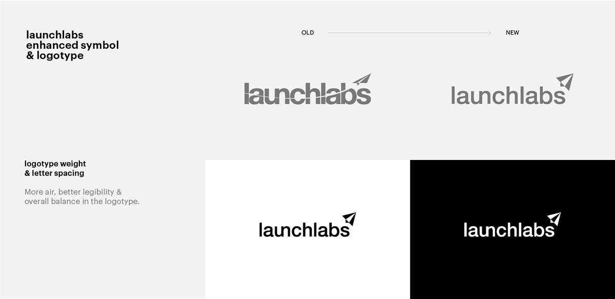
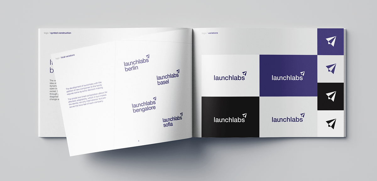
logotype & symbol /
Enhance, don't start from scratch.
Keeping the essence of the launchlabs existing logotype and symbol was a must as we didn’t want to lose brand recognition. In order to upgrade the current identity system we had to make sure we have a solid foundation. In the early stages of the brand enhancement our main priorities were improving the legibility, crafting a more solid standalone symbol and providing the company with a solution for building an international network.


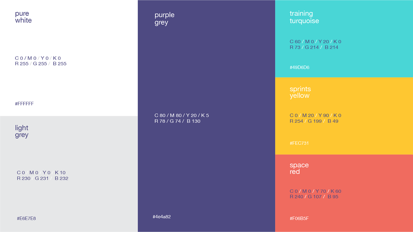
color palette /
Bold, contemporary, vibrant.
The color hierarchy is paramount for launchlabs. Purple grey is the leading color of the company. It carries a sense of expertise and solidity, but is also delicate enough to support a range of secondary colors that present the company portfolio.

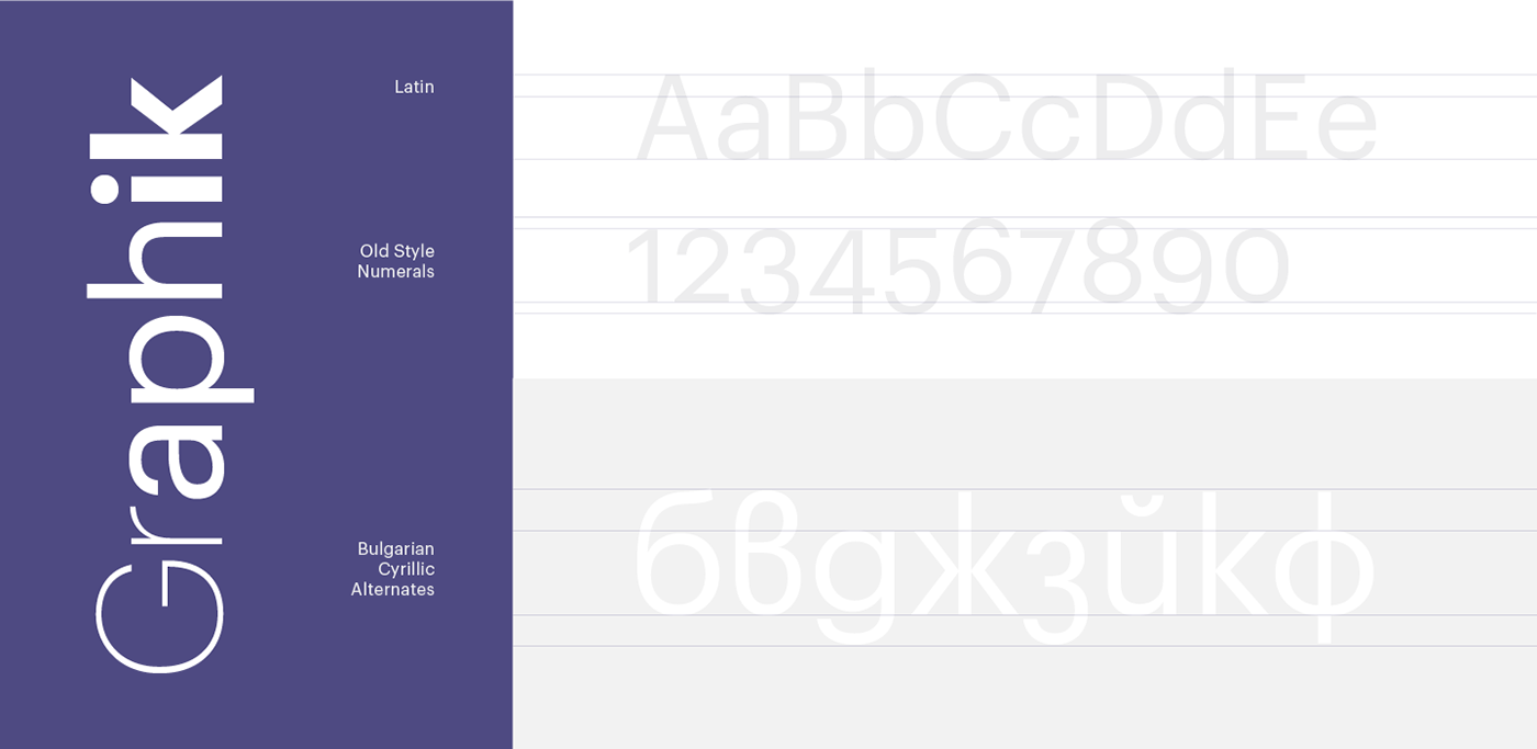
typography /
Simplicity at its best.
Graphik is the new font family of launchabs. Contemporary geometric typeface that suits all printed and digital needs of the company. The Bulgarian Cyrillic alternates are key for the company's local communication.

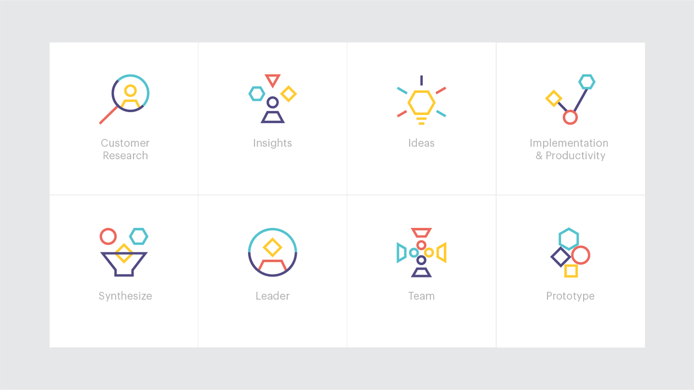
iconography & illustration /
Complex stuff explained simple.
We use simple geometric shapes to illustrate complex workflows in a relatable manner.
The linear objects represent various aspects and techniques and how they can be combined
in a multitude of ways.


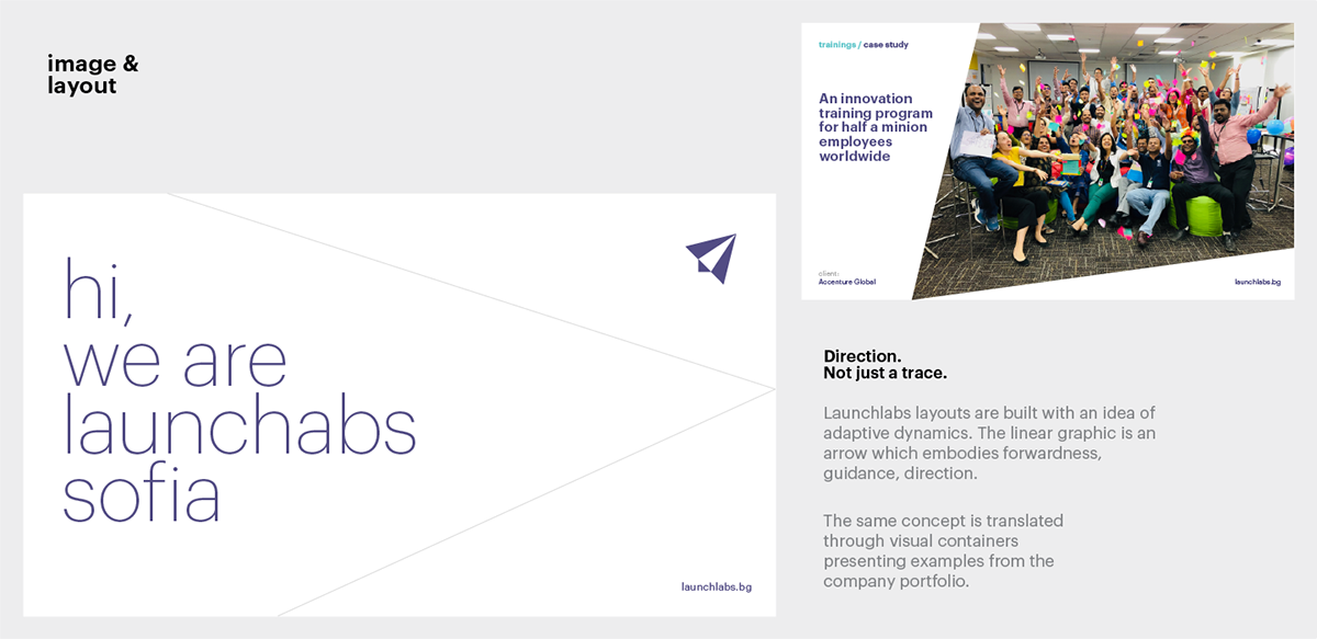
layout /
Geometry is powerful.
Launchlabs is not afraid of white space. On the contrary, it is of key importance in constructing company layouts.
We use customisable visualisation containers and lines to create dynamic compositions that focus on images and typography.


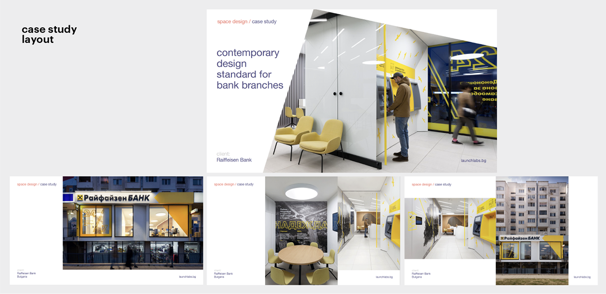
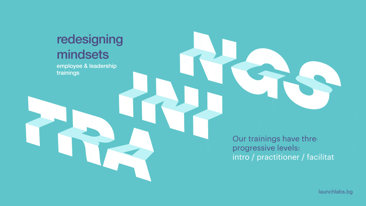
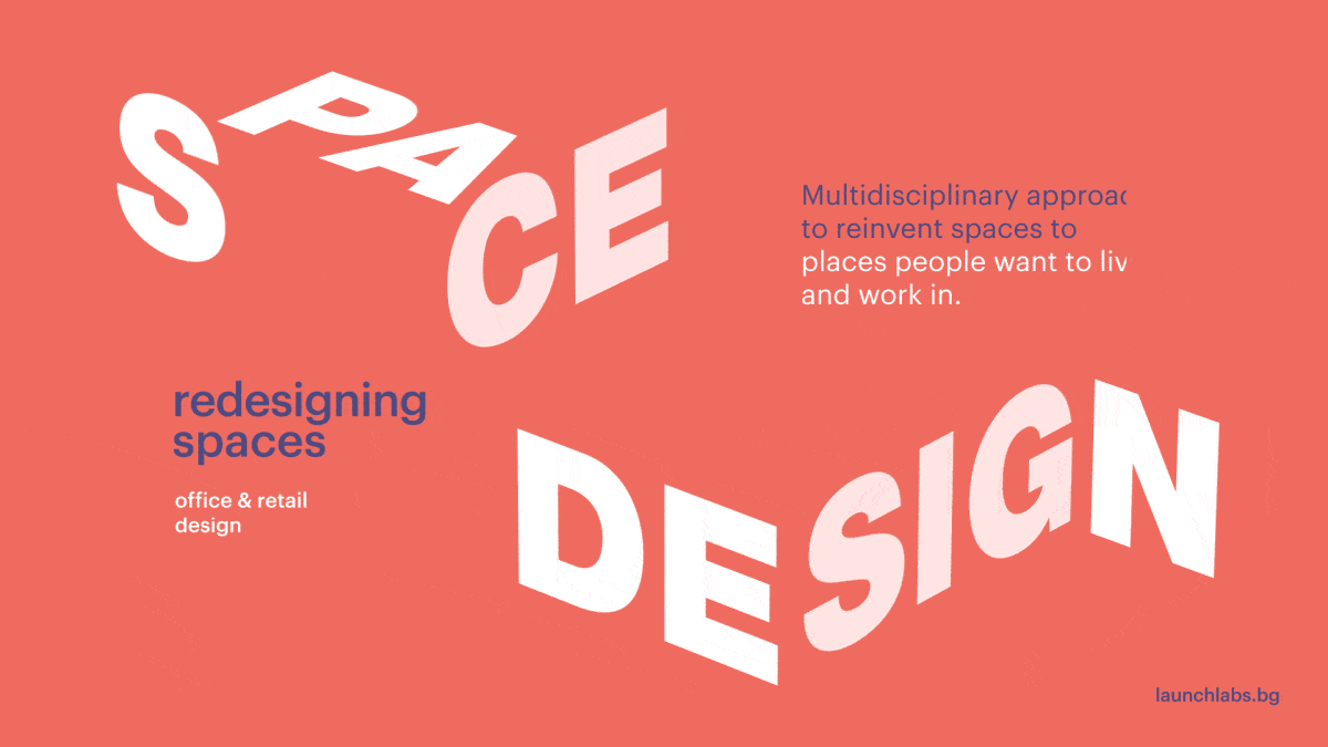
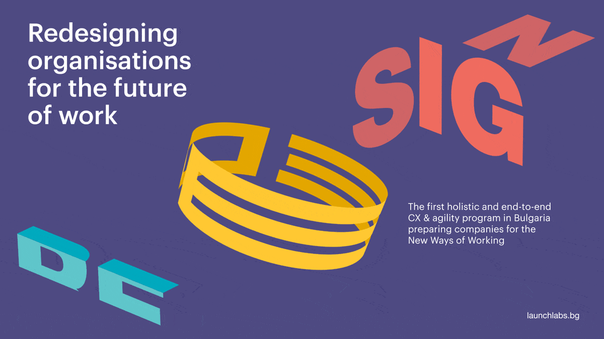
portfolio /
Typography as an image.
Dynamic typographic compositions uniquely communicate the essence of each of the launchlabs’ products. Visual metaphors translate the complex programs into an understandable language for both employees and company executives.


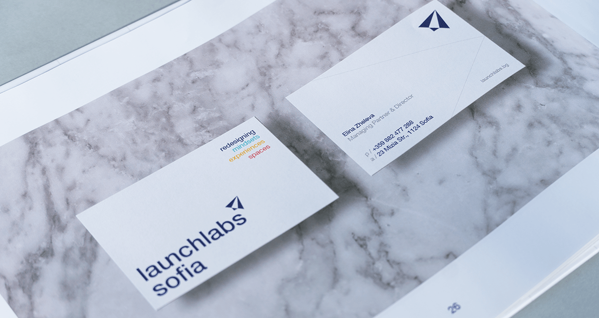
print /
Simplicity, elegancy & playfulness.
We strive for a minimalistic look with a special touch. Materials should enhance the light layout design. Through techniques like hot foil, textured paper or embossment, we aim to elevate your experience beyond the visual aspect.


credits /
Strategy & Positioning - Kristina Petrova, Rosen Terziev, Elina Zheleva - launchlabs Sofia
Creative Direction - Ivaylo Nedkov
Graphic Design - Ivaylo Nedkov, Atanas Giew, Tsvetislava Koleva
Motion Graphics - Atanas Giew, Alex Zhelyazkov
Client Service - Vera Schwartz
Creative Direction - Ivaylo Nedkov
Graphic Design - Ivaylo Nedkov, Atanas Giew, Tsvetislava Koleva
Motion Graphics - Atanas Giew, Alex Zhelyazkov
Client Service - Vera Schwartz


